
Iteration & A/B test
SOFIT-
Avatar

A dedicated social network for weight loss.
Finding the right balance between healthy eating & exercise, while experiencing how to sleep and stay hydrated plays a crucial role in your weight-loss journey.
Calories management, social interactions and community engagement within the SoFit App will help user stay motivated and consistent towards their weight-loss goals.
With persistent encouragement and social engagement, SoFit makes it easier for you to form and maintain successful new habits.
Duration
8 months
My Role
Product Design
Tool
Figma - wireframing & prototyping
Adobe illustrator - icon
Miro - mind map & decision tree
My contribution
Competitive Analysis, Wireframing, Prototyping, User flow,
A/B testing, Iteration.
AVATAR CONCEPT OVERVIEW
The hard diet and exercise will help users lose weight, but it's boring + lonely at the same time when there is no buddy to accompany and support. No guide leads you to the right exercise way. So we believe Sofia & Sam will be your good buddy to give support and guide you to achieve the weight loss goal.
Avatar involvement flow
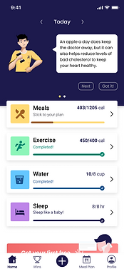
Avatar pops up from the Landing page to each module.
-
Giving overview and highlights of the app on Landing pages;
-
Allow user to choose an avatar (Sofia or Sam) when going through the Onboarding stage;
-
When users open a new tab (Wins, Meal plan, etc.), the avatar will give a tutorial to users;
-
On the Homepage, start with greetings, like good morning and etc, remind users to log meals, exercise, etc;
-
Besides that, the avatar will provide small tips or knowledge points;
-
In each Module, the avatar will guide users for the first time usage.

Avatar design
When designing the male and female avatar, the team decided to create a generic character that can bring our target users interest and earn their trust. I provide the ideas of the gestures, scenarios based on team brainstorming.

Credit @ Mengwen Yu
Utilize in app

Landing page


Onboarding

Tutorial

Homepage -
greeting

Homepage -
tips (interactive)

Exercise module -
first time
Exercise module -
first time

Water module -
first time
Observations
After we launched the app, we found out low user engagement rate with avatars, even though the avatar is very obvious and uses the high-value position on the homepage.
SoFit avatar interactive data analytics

Summary as of last 30 days:
-
Average no. of users interacting with avatar per day = 13.6
-
Average no. of clicks on "Next" button on avatar conversation per day = 9
-
Average no. of clicks on "Next" button per user per day = 9/13.6 = 0.66
-
Average no. of clicks on "Got It" button on avatar conversation per day = 26
-
Average no. of clicks on "Got It" button per user per day = 26/13.6 = 1.9
Only 13 users are interacting with Avatar on a per-day basis.
Problem & Oppotunities
In order to understand the problem, I made a decision tree to analyze the different factors including avatar gesture & movement, the content that the avatar brings to the user, and the two buttons ("Got it" and "Next"). By doing this activity, I found several opportunities that can increase the engagement rate.


Problem
-
When the avatar provides different contents, there is no change in movement & gesture, it seems not attractive to the user.
Opportunity
-
Providing different animations to the avatar with every click would look attractive and grab the user's attention.
Restriction
-
Using gifs or animation will put lots of effort on both designer and front-end engineer sides, but we will not know if this change will increase the engagement rate or not.
Problem
-
The current content that the avatar brings to users is too boring and too long to read, and there is almost no need to interact with the avatar.
Opportunity
-
The conversation could be changed to more informational quizzes. Two buttons could be used for options, it may require one more response screen to show if the answer was right or wrong.


Problem
-
"Got It" and "Next" are both positive buttons. People usually understand Got it as the meaning of I got this point, let’s move on to the next point. And when the user clicks on "Got it", the conversation stops. The user might not go back to check on the next statement.
However, changing the names of the buttons may not increase the number of users interacting with Avatar.
Opportunity
Change the "Got it" button to "Close"
-
Once the user clicks on "Close", the avatar shall minimize the way.
-
The app will start showing the avatar again on the next day or if the user closes/kills the app.
Pros & Cons
Option A: using gifs or animation instead of still images.
Pros: more attractive and visually appealing.
Cons: too much effort and work on both designer and front-end engineer sides.
Option B: change the content from long, boring tips or knowledge to more informational quizzes.
Pro: content become shorter and easy to read with one glance;
available to choose if users want to attend to quiz or not;
content-wise, there is many of nutrition information when users engage in quizzes.
Cons: need content writer creates quizzes.
Option C: simple change the "Got it" button to the "Close" button.
Pros: almost no additional work and can be quick iterate.
Cons: could be no changes in engagement rate.
Final decision
& A/B Testing
Adding quiz on homepage


Brainstorming
Final design
A/B Testing Result
-
increase avatar interaction.
-
2X increase in total engagement rate with interacting with the avatar.
-
The average number of users interacting with avatar per day from 13.6 to 34.23


